Top 5 Features of SharePoint Flexible Sections
In a recent article, I introduced you to Flexible Sections. This quickly becomes one of my favorite capabilities as it allows you to create much more visually appealing SharePoint sites. In today’s post, I’d like to introduce you to the five unique features available with Flexible Sections, which will enable you to optimize your designs and pages.
Feature # 1: Grouping
This is an important one, and trust me, one that saved me from going insane when designing the pages. Since Web Parts you add to the Flexible Sections can be added anywhere within the section, when you have several web parts and need to move them together, it might translate into a bit of manual and time-consuming exercise. Luckily, you can group several web parts together and move them all at once. This is a true lifesaver!

Example of Grouping in Flexible Sections
What’s also cool is that you can group the existing groupings, too. In other words, a group of some images can be added to another group consisting of that image group and text, for example.

Example of a Group of Images being added to another group consisting of an image and text.
Feature # 2: Arrange/Layering
Another feature we have (borrowed from PowerPoint) is layering. This is helpful when you add one web part on top of another and need to ensure it appears above the other web part. An example could be an image with text overlay, where you want to ensure the text appears on top of the image. You can change the following layering options:
- Bring to front – brings the web part all the way to the front of other web parts
- Send to back – brings the web part all the way to the back of other web parts
- Bring forward – brings the web part 1 level forward (if you have more than two web parts overlayed)
- Send backward – brings the web part 1 level backward (if you have more than two web parts overlayed)
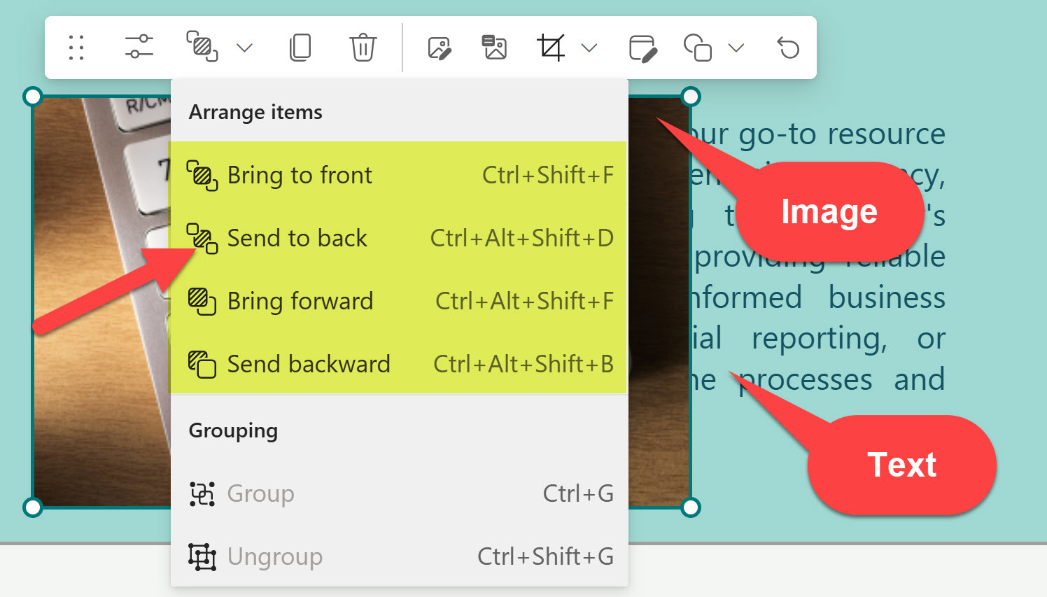

Example of text sitting on top of the image (Bring to front)
Feature # 3. Section Templates
Another feature available that might become handy is called Section Templates. This capability is available through the SharePoint Toolbox. If you’re struggling with design ideas and would like to see what’s possible or even adopt one for your page, definitely check it out!

Feature # 4. Resize Handle
This one is easy to miss, but it will become necessary. As you add or remove content from the Flexible Section, you would also need to determine the proper size of that section. This is controlled by the vertical resize handle that appears in the lower-right corner of the flexible section.

Feature # 5: Reorder for Mobile
This one is equally important to configure as well. Unlike regular sections, which have a rigorous layout, flexible sections do not. So you must tell SharePoint how to display the added web parts and render/stack them up on a mobile device (in which order). Using this feature may require a lot of trial and error, though.
On Desktop, you can configure the mobile layout to display web parts from left to right or top to bottom.

The diagram below illustrates the order in which different elements will be displayed on a mobile device, depending on the selected option.

Left-to-right mobile configuration

Top-to-bottom mobile configuration
Below is a screenshot of the above page on a mobile device, which follows a top-to-bottom order, making sense in this case.

Example of the Top-to-bottom display on a mobile device
By the way, would you like to see the designs possible with the Flexible Sections? Check out my portfolio on LookBook 365.

Share Article