SharePoint Online Navigation Best Practices
Navigation is one of the most essential elements of the SharePoint site, as it helps users easily navigate around your site and find the content they are looking for. If you recall from my earlier post, we have two (2) types of navigation in SharePoint: Site Navigation and Hub Navigation. In that article, I explained the differences between the two and provided instructions for setting it up. In this post, I would like to share best practices for building and designing your SharePoint navigation. The advice listed below applies to both Site and Hub navigation.
Best Practice # 1. Keep the navigation menu list short
Less is more. Just as you probably feel overwhelmed in a supermarket or airport with all those signs, users also feel overwhelmed when they have to comb through a zillion navigation links and drop-downs. Keep the menu nice and short. I can’t tell you how many times I see site owners add 55 links, and the SharePoint site looks like a flea market.

Best Practice # 2. Choose between Site and Hub Navigation
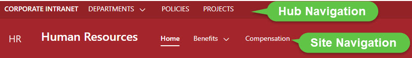
It is equally important to add navigation links to the proper area/type of navigation. As already mentioned, we have two types of navigation in SharePoint: Site navigation and Hub navigation. Hub navigation usually links the various sites in the hub, while site navigation provides local links for that site only. So, if you say you have a Human Resources site and created multiple pages within that site for different areas of Human Resources, the link to the HR site would be located on the Hub Navigation, while links to pages will be located on the Human Resources site itself. Hopefully, this makes sense.
Best Practice # 3. Use Labels and Sublinks
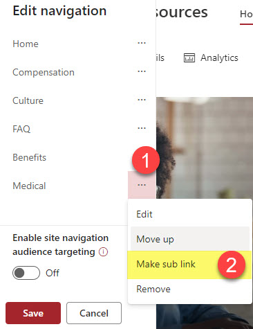
If you do end up with many links, organize them into sublinks. We can create up to two levels of navigation links, so use this capability to keep the navigation menu clean and tidy. I explained how to do this in this article.
Best Practice # 4. Use the Mega Menu instead of the cascading option on Communication Sites
This might be a matter of personal preference, but I always recommend the mega menu option on Communication sites over the classic “cascading” style. You can see all the sublink options with one click instead of manually clicking on each label separately. Some users prefer the classic drop-down, though, so this might be something to tailor to your users’ tastes.

Example of a Mega Menu Navigation on a Communication Site

Example of a Cascading Menu Navigation on a Communication Site
Best Practice # 5: Enable Audience Targeting
This is another piece of advice to help you keep your menu nice and clean. By default, when you add links/labels to the navigation menus, they are visible to everyone visiting your site. However, you can keep the links relevant to the user logged in via the Audience Targeting feature. In this article, I provide instructions on how to set it up.

By the way, Audience Targeting, while optional, is kind of mandatory when you share externally – otherwise, external users will see the whole navigation menu even though you shared only one SharePoint site. I explained this phenomenon in this post.
Best Practice # 6: Hide Site Navigation on Communication sites if connected to a Hub
This advice might conflict with what I mentioned above, but I personally don’t like building extensive navigation menus on the Communication Sites if they are associated with the Hub. This is because the navigation looks weird and confusing – sometimes I think I had too much alcohol 🍷 and see double on the screen 😊

This problem applies only to Communication sites. On Team Sites, the navigation is on the left-hand side by default, so it is not an issue.
Best Practice # 7: Do not hide navigation on the Team Sites
Speaking about the Team Sites, I have some advice for you there as well. While hiding site navigation on the Communication Sites might be wise, don’t do it on the Team Sites. This is because Team Sites have a mandatory Recycle Bin link that appears there by default. If you hide the Team Site navigation (which I explained how to do in this post), the users won’t have an easy way to navigate there and will need to click Gear Icon > Site Contents instead.

Best Practice # 8: Use built-in navigation links on Team Sites
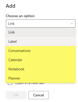
Another piece of advice related to the Team Sites. If you are using other Team Site/Microsoft 365 Group assets, like Group Calendar or Planner, you can quickly and easily link to them using the built-in links. You do not need to copy/paste URLs – just choose what you are linking to, and it will do the rest. I explained how to make it happen in this article.
Best Practice # 9: Link to the root of the list or library
If you are creating links to lists and libraries on your site, I always recommend linking to the “root” of the lists or libraries and not the URL of one of the views. For example, if you created a firm calendar using a custom list and also created a Calendar View of it, you might want users to see the calendar view by default. So, just make the calendar view a default view on a list, and once you link to the root of the list, it will automatically resolve and display the default calendar view. In contrast, if you create a navigation link to some other view (i.e., Grid), the users will see it when they click on a link. Hopefully, that makes sense. I explained this issue here as well.
![]()
Best Practice # 10: Make sure recipients have access to linked content
Trust me, I have seen a good share of links that link to other sites, lists, and libraries that might have permissions different from the original site, and when the users click on those links, they get the infamous “Access Denied” message.

So, whatever you are linking to – make sure users have access.
Best Practice # 11: Open in the New Tab if appropriate
Another technique to employ is to open some links in a new tab. If you want to make sure the linked content does not “close” the site you are on, just check that “open in new tab” checkbox. This is especially useful when linking to sites and content outside of SharePoint.

Best Practice # 12: Use Emojis
Historically, the navigation menu in SharePoint was always just text – and it always looked boring. Luckily, now we can spice it up with some emojis (small icons). This is not a function of SharePoint but rather Windows OS. All you have to do is click the Windows key + . (period) on your keyboard to display the emoji icons. This cheap trick will bring some life to your site and make your boss happy!


Share Article