Create HTML Dashboards in SharePoint with Copilot
I usually don’t blog about features that were just released; I prefer to write about ones that have been around longer and are more stable and “set in stone.” However, one feature released just a few months ago rocked the SharePoint world and community positively. I am talking about the ability to create HTML dashboards from a list or an Excel document via Copilot. My social media posts were filled with users testing this feature and admiring the new capability. I wouldn’t be surprised if these posts got more likes and views than Kim Kardashian’s Instagram account. In this article, I’ll explain how this feature works.
Charts in SharePoint
To understand the excitement, we first need to understand the history of charts in SharePoint. Historically, we didn’t have many choices. Out of the Box, we had the Quick Chart Web Part, which was pretty static and very primitive, with lots of limitations. I wrote about it in this article.
The next step up is Power BI. However, that required additional licenses and, more importantly, technical expertise to build it out. So naturally, this option was mostly reserved for a select few people within the organization.

Copilot Dashboards
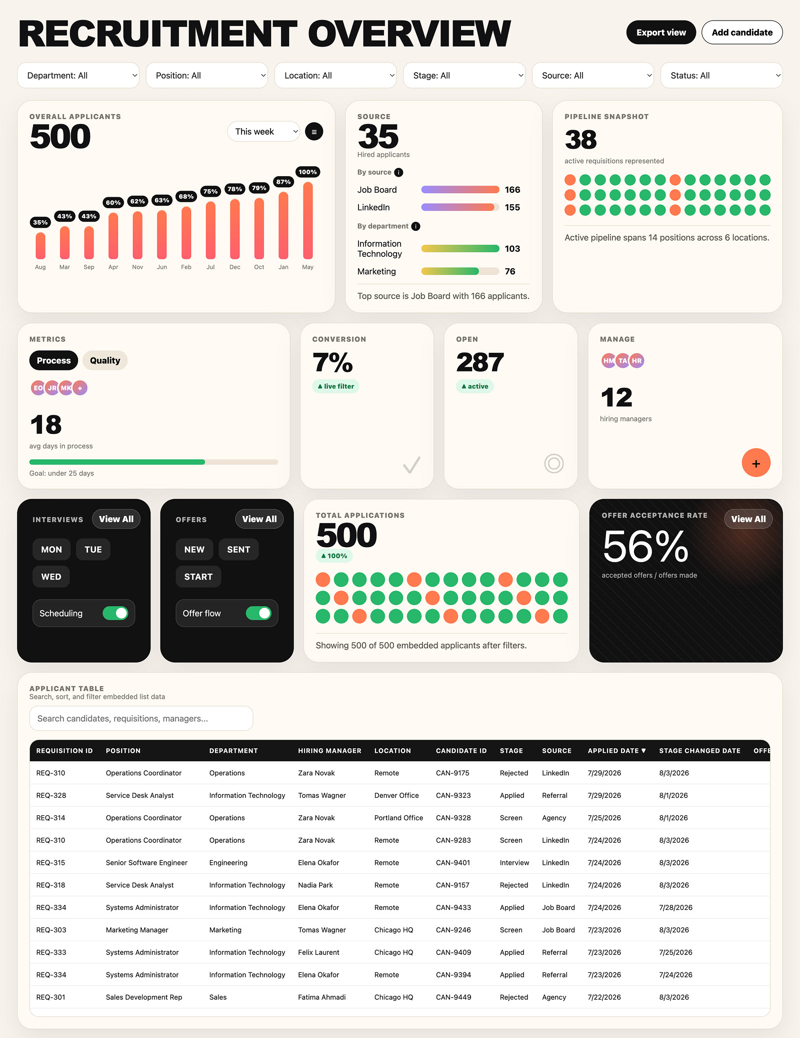
And this brings us to this new capability. We have had Copilot/SharePoint integration for several years; however, this recent change lets users generate an attractive dashboard with just a few prompts. Here are the steps to achieve this:
Step 1: Create a List
If you do not have a list yet, create one – feel free to follow the instructions here.

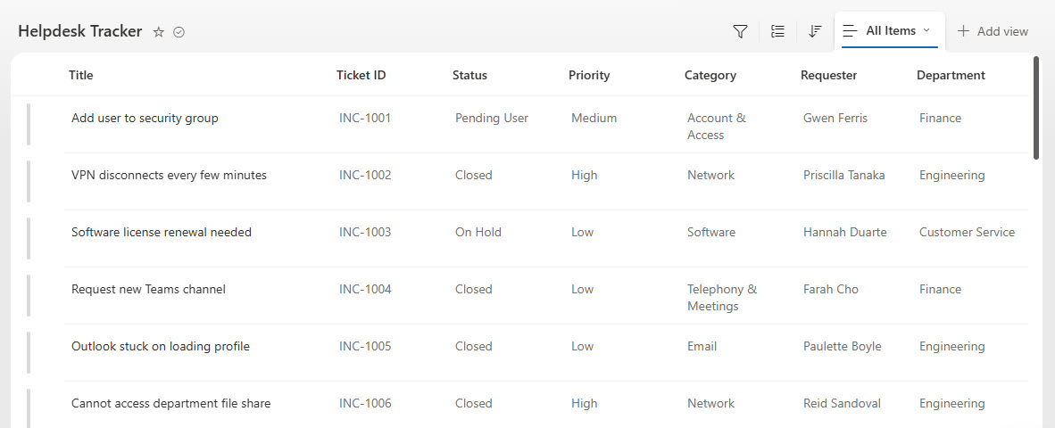
Step 2: Populate with Data
Next, add data. You can do this by manual entry or by copying and pasting from Excel.
Step 3: Ask Copilot to create a Dashboard via a prompt
- And now, the exciting part. Click on the Copilot icon and open the Chat window.
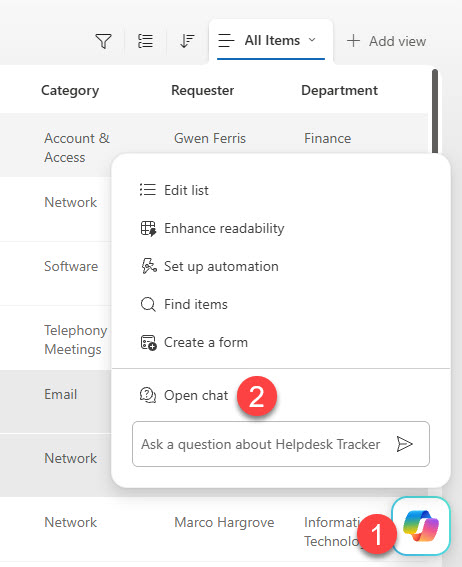
- In the chat window, provide instructions (a prompt) for the dashboard you want to create.

- After just a few minutes, it will produce a dashboard with a link for you to click.
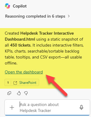
- Once clicked, it will open up the first pass of the dashboard in HTML format
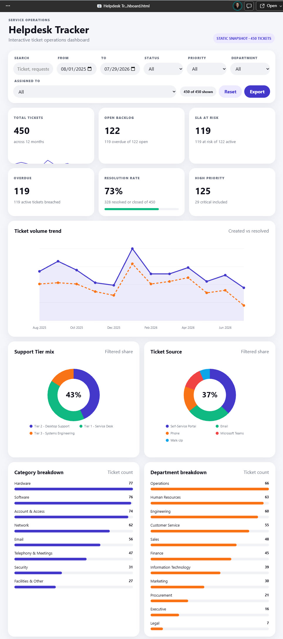
- You can then continue chatting with Copilot and refine the dashboard further (change styling, colors, add/remove charts, etc.)
Nuances about the Copilot Dashboard capability
- Just as with most Copilot features, a Copilot license is required for you to create these dashboards.
- You can also create a dashboard from an Excel document in a Document Library by pointing to it from the Copilot Chat window.
- You have to be specific as to where the dashboard will be saved – when I created it for the first time, it simply downloaded an HTML dashboard to my desktop. I recommend specifying the physical location (i.e., document library) for your dashboard in your prompt.
- HTML Dashboard created from an Excel document gets saved inside the Document Library/folder where the Excel doc with data is.

- HTML Dashboard can also be a live feed from the List or Excel. In other words, if data changes, the dashboard will adjust live accordingly. Make sure to specify these details within the prompt.
Sample Prompt
I know it can be challenging to come up with that magic prompt, so I am sharing one that was used to create the example above. Feel free to adjust as needed.
Create a professional interactive dashboard for the “Helpdesk Tracker” SharePoint list. Columns: Title, Ticket ID, Status, Priority, Category, Requester, Department, Location, Assigned To, Support Tier, Source, Created Date, Resolved Date, Days Open, SLA Status, Overdue.
Style: font Segoe UI/Arial. Light gray page background #F5F6FA, white rounded cards (20-24px radius), soft shadows, no borders, no stripe patterns. Pill buttons/badges. Progress bars: flat light gray #F1F2F5 track.
Colors: indigo #4338CA primary (bars, buttons, lines). Green #10B981 positive/on-track. Orange #F97316 secondary. Red #EF4444: overdue/critical. All numbers/headings black #0F0F1A. White text on colored badges.
Top bar: search, date range, filter row (Status, Priority, Department, Assigned To) with uppercase labels, “X of Y shown” counter, Reset, Export.
KPI row (6 cards, no icons): Total Tickets (real sparkline), Open Backlog, SLA At Risk, Overdue, Resolution Rate (mini progress bar), High Priority. Each: uppercase label, bold number, short plain-text context (e.g., “82 breached of 328 closed”).
Charts: line chart “Ticket volume trend” (solid Created + dashed Resolved, gradient fill, hover tooltip, English months always). Two donuts (Support Tier mix, Ticket Source): large bold center %, distinct slice colors, legend below. Category/Department breakdown: one solid color per row bar with count.
Table “Open backlog by Assignee”: sortable, searchable, color-coded priority badges, red Days Open if overdue.
Fully interactive: filters update everything live, hover tooltips everywhere, sortable/searchable tables. Embed all data as static values — no live SharePoint fetch; must open fully offline in any browser.
Additional Examples
Want to see additional examples of HTML Dashboards created with Copilot prompts? Check out my LookBook365.com portfolio!

Share Article