SharePoint Pages Design Best Practices
Quite often, I am asked by my clients to share best practices on the design of SharePoint pages. Now, I will be upfront: I am not a graphic designer and do not have a formal design background. But I am Jewish, and when did you ever see a Jew not sharing their opinion on something even though they are not an expert in it? 🙂. Seriously though, I have seen many sites and pages designed by clients and others and accumulated over the years a list of “my own” preferences and best practices. So, I would like to share those with you today.
Best Practice # 1: Keep the content above the fold
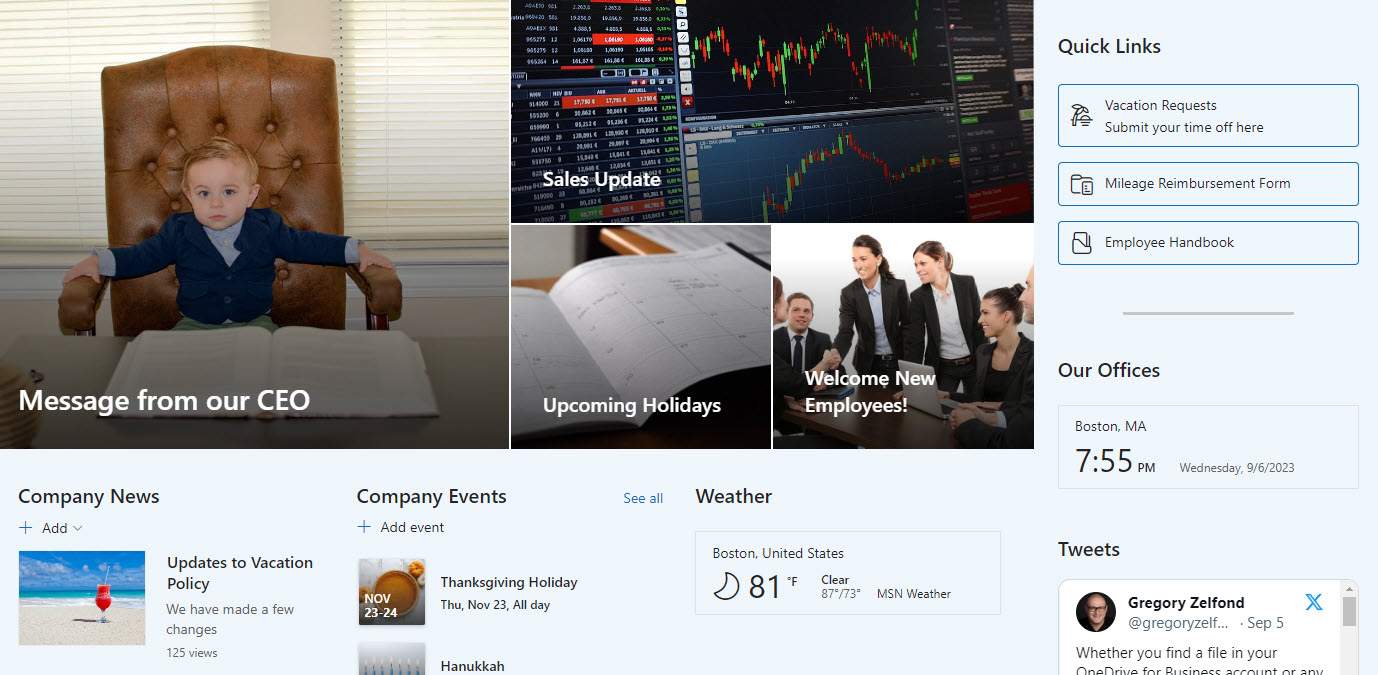
This is my biggest issue with the many pages I see. I always see lots of great content added by site owners to their sites, but users have to scroll up and down a lot, and frankly, not many users do that. I always advise my clients to put all or most of the content above the fold. To translate into pure English, when I look at your pages, I should see the most important info on the screen, above the lower edge of the monitor, without the need to scroll down.
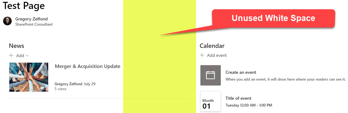
Best Practice # 2: Reduce white space on the screen
Another thing to address would be to reduce the amount of white space on the page. By default and its design, SharePoint adds lots of white space to its pages. On one hand, it makes it attractive; on another, it wastes valuable space on the page. A little bit below in this article, I will share some of the techniques that will allow you to reduce the white space.
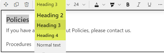
Best Practice # 3: Use Text Headers
Another advice I have for you, especially if you have lots of text on your pages – make sure to use Text Headers. You can use H2, H3, H4 headers. They will help you organize major sections/chapters and make them esthetically pleasing and easier on the eye for your site visitors.
Best Practice # 4: Use Page Anchors to link text sections
This one is kind of related to the tip above. The benefit of using Text Headers (Paragraphs) is that they become linkable anchors. I described this feature in this article.

This is really handy if you have lots of text on a page and need to guide users to a specific section within a page. It might also be handy if you try to build a Table of Contents (TOC).
Best Practice # 5: Create 3-column layout + a vertical column
This advice is probably related to Tip # 2, about reducing white space on a screen. One way to achieve this would be to use a 3-column layout available.
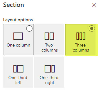
Another trick to reduce white space horizontally even more is to create a Vertical column (the so-called 4th column). Here is a video on how to achieve this.
Best Practice # 6: Do not embed libraries or lists
One mistake I see many site owners make is embedding entire libraries or lists right onto the pages. Yes, there are web parts for those, but there are quite a few problems with this method – and I documented them all in this article.
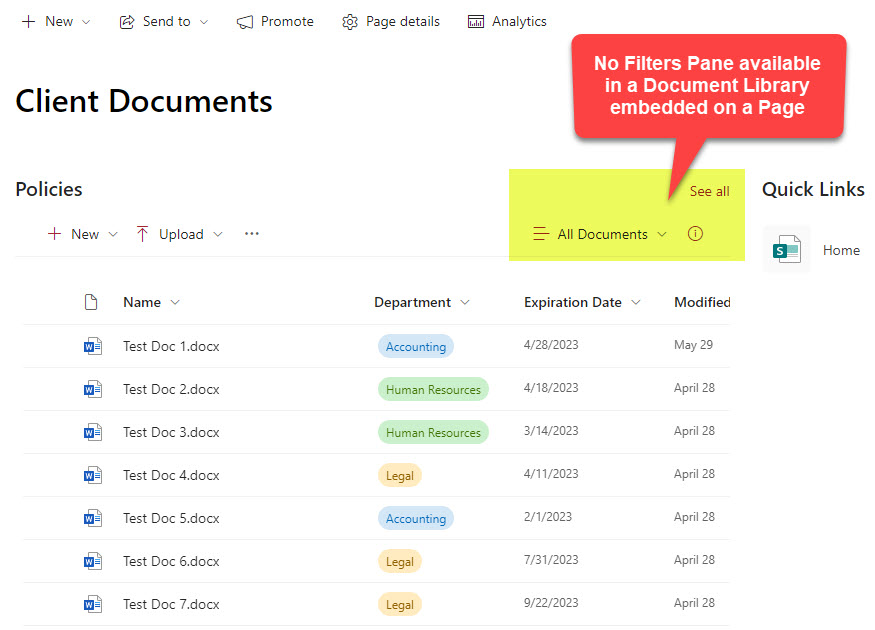
Instead, link to the libraries using Quick Links or the site navigation menu.
Best Practice # 7: Disable Page Comments
I blogged about this one, too, in the past. While, in theory, page comments might be a good idea, they have minimal practical advantages. So, always deactivate them. Again, I provided instructions on this in an earlier blog post of mine.

Any comments or conversations should occur either in Teams or Yammer.
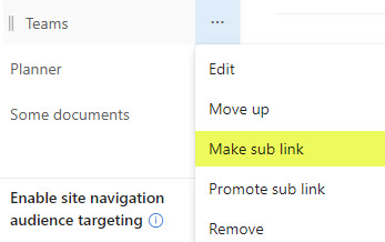
Best Practice # 8: Keep Site Navigation clean
This is not so much of a page design tip but that of site maintenance. Make sure to keep the site navigation clean. I do not want to see 55 links appearing on the left or top part of the site (page). Do not overwhelm the users. Instead, minimize the number of links and organize them into sublinks.
Best Practice # 9: Hide site navigation if need be
Another tip related to navigation… And this mostly applies to Communication sites that are part of the Hub. If you connect the Communication Site to the Hub, you will end up with 2 sets of navigation, one right under the other. The site navigation will appear right below Hub Navigation. And this might confuse users. So, I always advocated for either hiding this navigation altogether or keeping it nice and short.
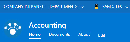
Example of Site Navigation appearing right underneath Hub Navigation
Ability to hide Site Navigation via the Change the Look option
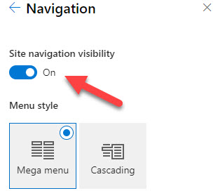
Best Practice # 10: Do not hide site navigation on Team Sites
You might be confused by this last piece of advice, as I just told you the opposite above. This one, however, applies just to Team Sites. A recently added feature allows site owners to hide Team Site Navigation completely on Team Sites. However, in doing so, it will also hide a link to the Recycle Bin. And since Team Sites are primarily used for collaboration, restoring the files from the Recycle Bin is always necessary. If the Team Site navigation is hidden, users need to go to Gear Icon > Site Contents to access it, which adds unnecessary extra clicks and steps. So my advice is – just leave it in its place.
Example of a Team Site with Site Navigation hidden – no easy way to access the Recycle Bin!!!

Share Article