How to create a Chart from a list in SharePoint Online
One of the frequent requirements on Intranet sites is to display some sort of charts/graphs. In addition to spicing up the look and feel of a page, the charts provide some valuable insight and information. Usually, the data and corresponding graphs/reports reside in Power BI or 3rd party databases. However, sometimes you just need to display a really simple graph, based on just a few data points. Moreover, with the revamp of the Microsoft Lists app, lists have become a popular choice for data storage among SharePoint and Teams users. So in case your data resides in a list, there is a hidden gem in SharePoint called Quick Chart Web Part, which will allow you to build and display a graph on a SharePoint page. Let me explain.
What is a List?
Before I explain how to create a chart, it is important to understand the components that are necessary to make this happen. In case you are wondering what a Microsoft List is – check out this post first.
What is a Chart?
If you are wondering what a chart is, I suggest you return to the third grade of elementary school. 😀. Yep, you probably should not have stared out the window, when the teacher explained those concepts. Thank God for Wikipedia.
What is a Quick Chart Web Part?
A Quick Chart Web Part is an out-of-the-box Web Part that exists in SharePoint and allows us to either build simple charts “on the fly” or display them based on data in the SharePoint list (the topic of this post). I introduced the Quick Chart Web Part in one of my previous blog posts.
Use Case
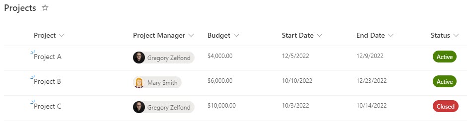
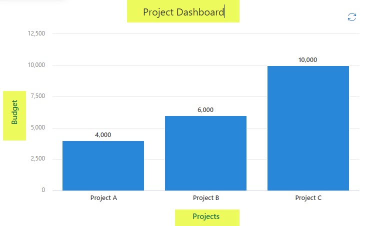
I have a list of Projects stored in a custom list, as shown below. In addition to project names, I have start and end dates, budget, and project status columns.
How to create a Chart from a list in SharePoint Online
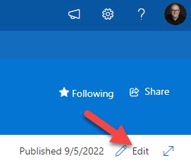
- On the site where the list was created, click the Edit button in the upper-right-hand-corner to edit the page
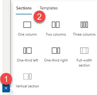
- Add a new section and choose the column layout you would like to have (I suggest 1 column, so there is plenty of real estate on a screen for the chart)
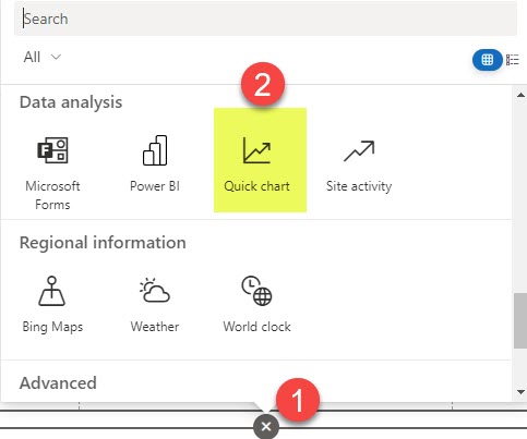
- Click the plus sign, then choose Quick Chart from the list of available web parts
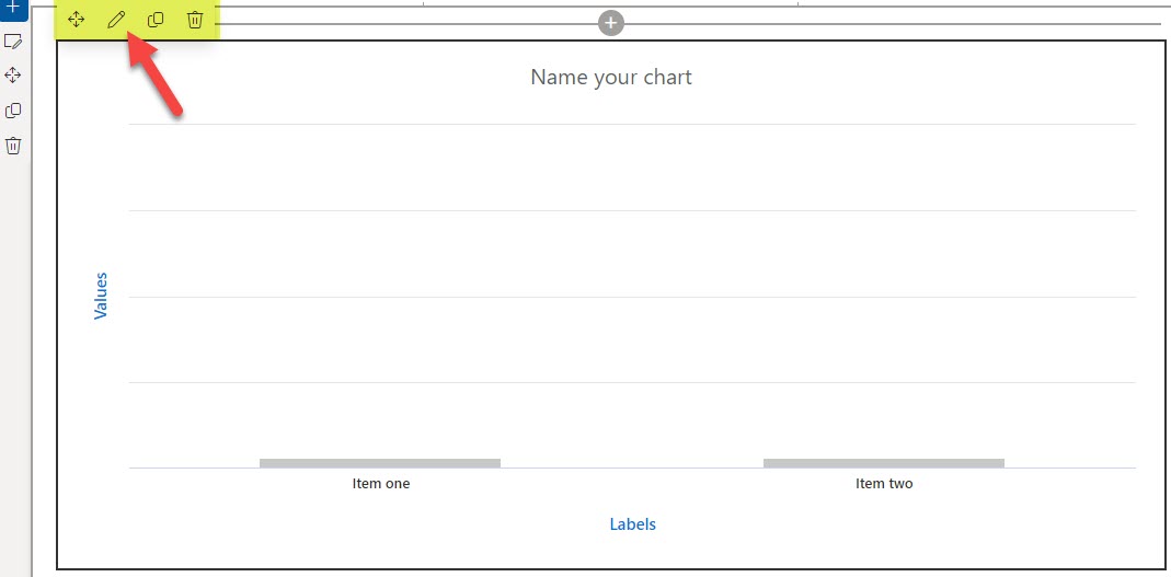
- You will see the web part added to the page. Click the pencil icon to configure its settings.
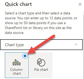
- On the right-hand side that opens up, choose the chart type. Two choices are available: Column (Bar) Chart and Pie Chart.
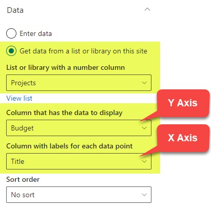
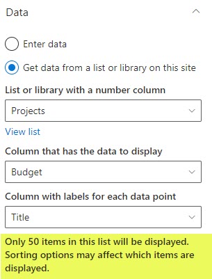
- Next, choose the source of data. In our case, select the radio button next to “Get data from a list or library on the site.” Then, choose the column from a list that will represent values (Y-Axis) and the column that will represent X-Axis. In my case, the Title (Project Name) is X-Axis, and the Budget is Y-Axis). In case you get an error: No list available on this site, read the Notes section at the bottom of this article.
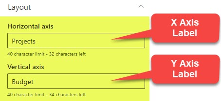
- Next, type in the labels for the Axis above. You may type any text that makes sense to you/chart you have.
- Finally, give your chart a name (in my case, I called it Project Dashboard)
- Click Republish in the upper-right-hand corner to republish the page.
Important Notes about Quick Chart Web Part in SharePoint Online
Below, I would like to summarize a few important notes and limits when it comes to using list data with Quick Chart Web Part in SharePoint Online.
Data from Document Libraries
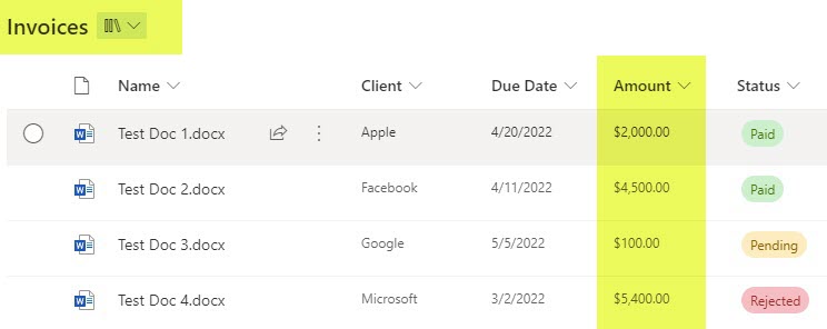
Quick Chart Web Part is not limited to getting data from just the list. You can also get data from document libraries as well! Here is an example/use case. I have a Document Library called Invoices, where I track the amounts and statuses of project invoices.
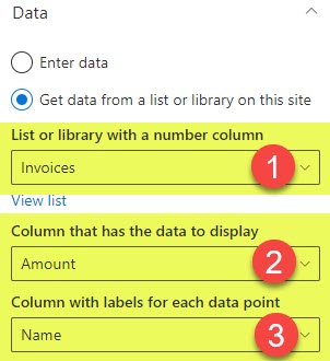
If I choose the Invoices library as a source and select a File name for X-Axis and Amount for Y-Axis…
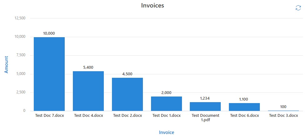
…it will produce a nice graph/chart as well.
Limit of 50 data points on a list
If your list or library contains more than 50 items, you will get the following warning when connecting them via the Quick Chart Web Part: Only 50 items in this list will be displayed. Sorting options may affect which items are displayed. Essentially what that means is that Quick Chart Web Part only allows a max of 50 data points to be displayed.
“No list available on this site” error message
You might see the following error message when trying to connect your chart with the List: No list available on this site. Alternatively, it will allow you to get data from other lists and libraries but won’t display your list on a site in a source of data drop-down column.
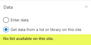
The reason for this is that in order for the list or library to be a valid source of data for Quick Chart Web Part, it must have at least 1 (one) text column (for X-Axis), and either 1 (one) number or currency column (for Y-Axis). Unless both of the above conditions are satisfied, you will get the above error message/scenario.

Share Article