8 Proven Ways to Improve Your SharePoint Site Design
SharePoint has undergone significant evolution since its initial release in 2001. Frequently the target of jokes for its clunky and outdated interface, it has now become the sexy beast that makes all those requests to make Intranet not look like SharePoint quite stupid. This has obviously become possible with the modernization and total revamp of the application back in 2016. However, thanks to recent features and enhancements, it has truly empowered site owners and marketing professionals by pushing SharePoint design into overdrive. So, I thought I would summarize some of those design tricks that will help you make SharePoint look less like SharePoint. 😀
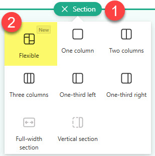
1. Flexible Sections
This is by far the most significant leap forward in modern SharePoint’s design possibilities. For years, we created modern pages that were all “boxy,” with one web part below the other. Flexible Sections changed all that – and now, we can place web parts anywhere on the page, and even overlaid on top of each other. I explained the concept of Flexible sections here.
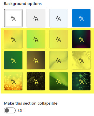
2. Background Images
Sections alone, even the flexible ones, would not provide the desired effect without the background images. For years, the only choices were just a few theme colors/shades. Now we can upload custom images too! I explained this capability in this article.
3. Design Ideas
Another breakthrough came when Microsoft released the Design Ideas capability. It is the same capability we have in PowerPoint, where the app suggests possible design layouts based on content/web parts. It definitely became quite a help for those of us who are not graphic designers 😊. Once again, I blogged about this functionality here.

4. Divider and Spacer Web Parts
Another trick to make your SharePoint pages shine is to use Divider and Spacer web parts. They usually get little attention and are often overlooked, but they can help make your page look cleaner and easier to read by aligning and separating the content, respectively. I devoted the whole blog post to those two silent heroes in this article.

Divider Web Part in SharePoint

Spacer Web Part in SharePoint
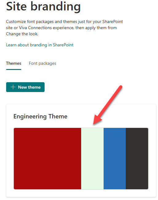
5. Custom Theme
This was another breakthrough. Since SharePoint’s modernization in 2016, we have had only eight default color palettes to choose from. And while we had the tools to create custom color themes and install them via PowerShell, the process was clunky, very limited, and not available to Site Owners themselves. This all changed with the introduction of Custom Themes and Brand Center. We can now create any custom themes, and the functionality is even available at the site level! I explained how this works here.
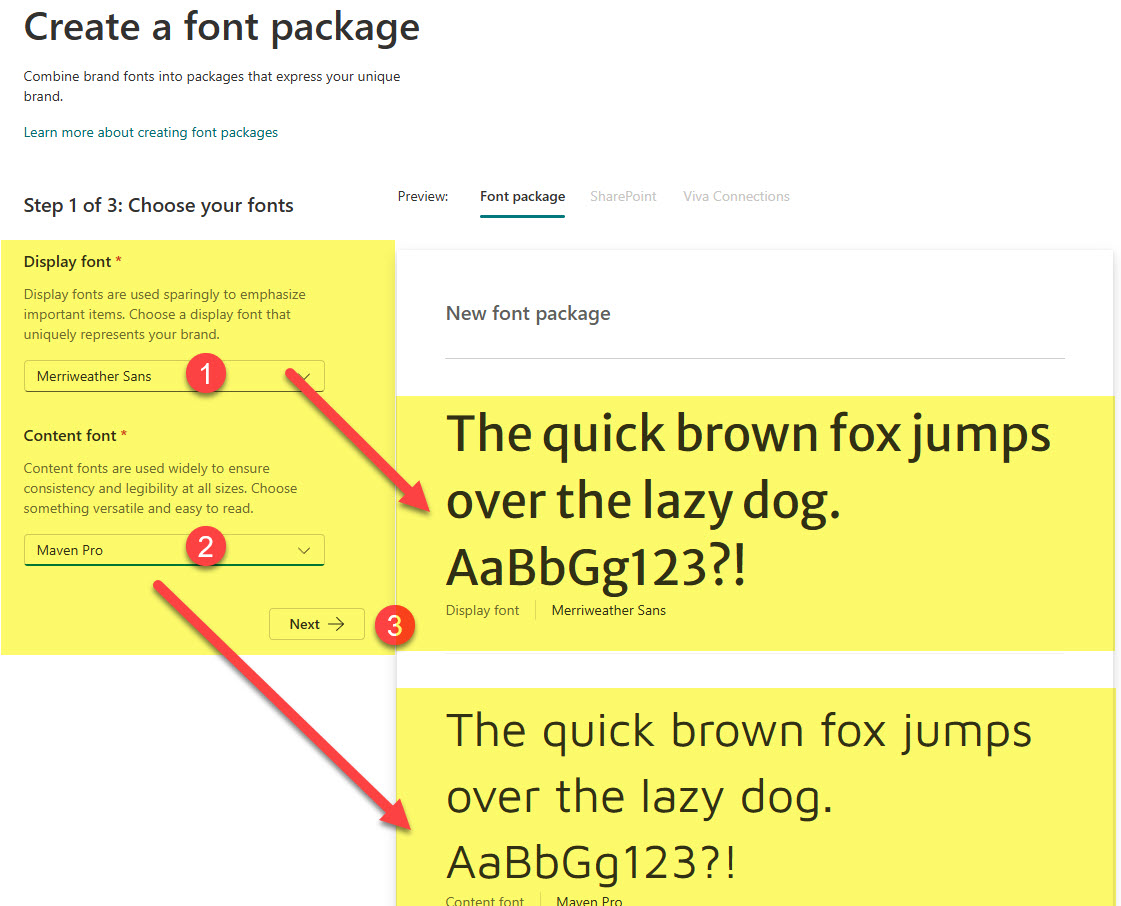
6. Custom Fonts
This is somewhat related to the custom theme I mentioned above. For years, everyone enjoyed the same font in SharePoint. You were out of luck if you wanted a custom. Now this is no longer the case. We can now upload any font type to SharePoint (via Brand Center) and make it available to the Site Owners. Here are the instructions for this.
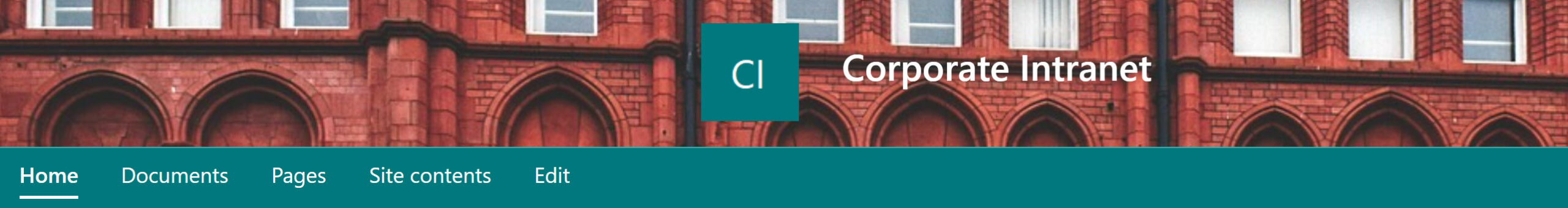
7. Extended Header
Another trick to keep in mind if you want to make your SharePoint site stand out is to utilize an Extended Header. Not only does it make the header area and logo larger, but it also lets you change the logo’s position and upload a custom background image!!! Here is a post that describes the functionality.
8. Extended Footer
And how can we forget the footer! Not many pay attention to it, but it can serve the purpose by displaying some menu items and secondary links. Check out this article for instructions.

If you’d like to see these design elements applied in real-world SharePoint intranets, check out my portfolio on LookBook365, where I showcase many practical examples.
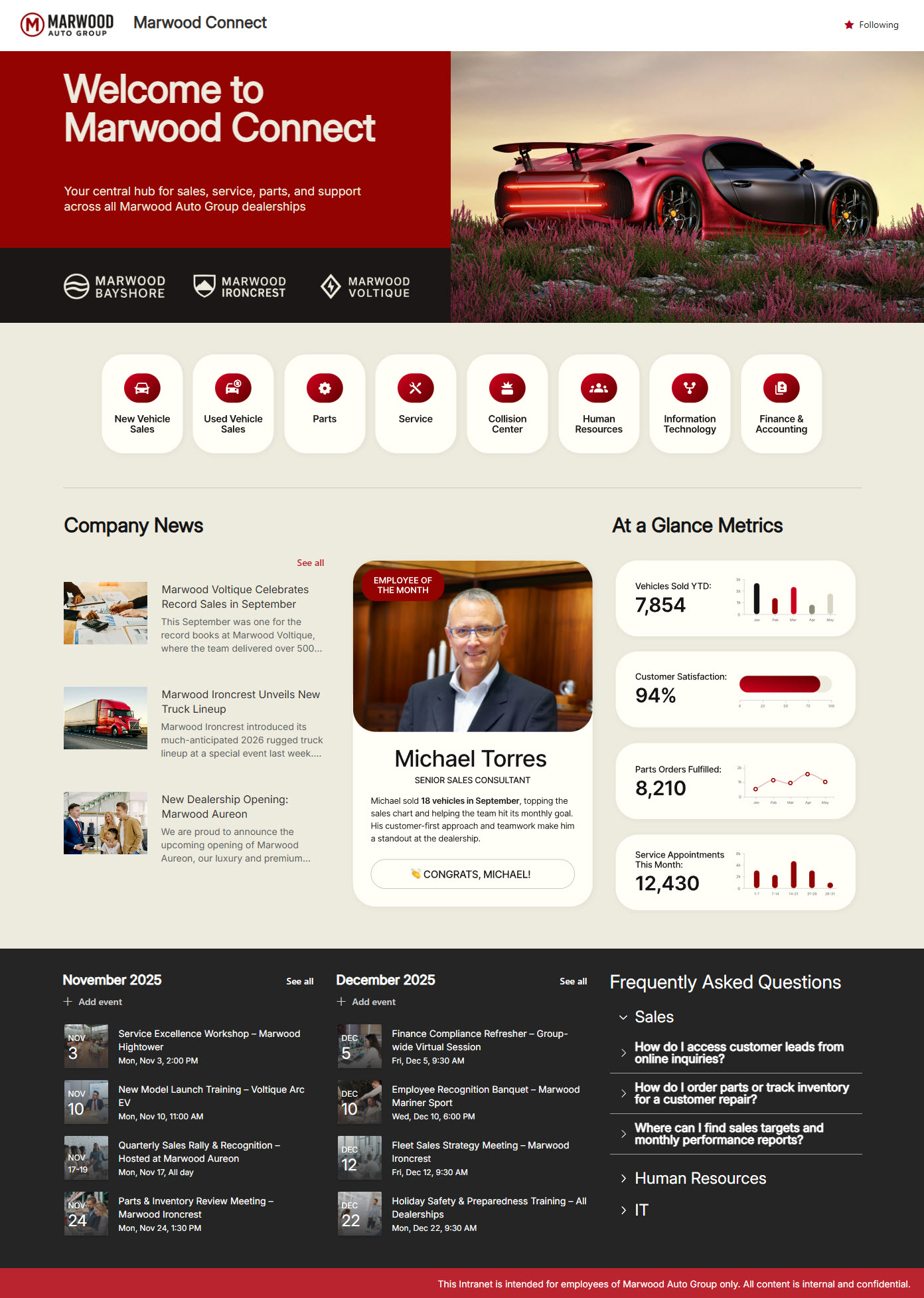
Example of a Company Intranet Homepage using Flexible Sections, Custom Theme, and Custom Fonts

Share Article