How to organize content on a SharePoint page using collapsible sections
One of the significant changes made recently to SharePoint pages was the ability to create collapsible sections. We already had quite a few tricks in the book to organize content on a page (vertical section, multiple column layouts, etc.). The recent improvement allows site owners to create what was only possible previously via custom code. In this article, I would like to describe this incredible new feature.
What are collapsible sections?
When you add content to your SharePoint pages – it is all static, meaning every site visitor/member will see all the information on the page in the same exact spot. However, what if you have lots of content on a page and don’t want users to scroll down to the bottom of a page to find the specific piece of the content they are looking for?
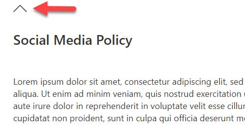
Collapsible sections allow you to do just that – users will be able to expand/collapse sections of a page as necessary, without the need to scroll up and down much.

How to create collapsible sections
- Edit the SharePoint Page


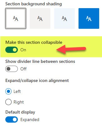
- On the right-hand-side panel, toggle the switch ON next to Make this section collapsible

- You can also tweak some other settings, like show or hide divider, icon alignment, and whether or not the section will show as collapsed or expanded by default.
- Give your section a name (Optional)

- Republish the page

Best practices for using collapsible sections
- Collapse by default. When configuring a collapsible section, you can specify whether the section will be expanded or collapsed by default – I recommend keeping it collapsed by default for maximum screen real estate.
- Give each section a title. Titles are optional but beneficial for users to understand what is inside of the collapsible section. Make sure to give it a descriptive title (i.e., News from the EMEA region).
- Keep the top section expanded. If you have several collapsible sections added to your page, it might be best to keep the top section expanded (while others collapsed), so the users will see some content right away, without extra clicks.
- Add supportive text. It might not be a bad idea to add the text “click here to expand/collapse” to let visitors know what they need to do to access or hide the information.

- Give each section a different color, so it looks better/visually stands out
Use cases for collapsible sections
Here are a few uses cases I can think of for collapsible sections:
- Text and Image-based Knowledge base
- Frequently Asked Questions (FAQ) database
- Sections for organizing content for different audiences. For example, a section specific to North American employees, a section for European Union, etc.
- A page that is heavy with text that you want to convert into the Table of Contents by collapsing the sections of a page and giving each section a Chapter/Section number and name


