Why you should not remove default features in SharePoint
Quite often, I get requests from clients and blog followers asking how to remove some default features/links from SharePoint. Things like the Recycle Bin or the Follow Site button. Most of these options are not removable unless you use custom code/CSS. With this post, I would like to explain the features that I hear users wanting to remove most often and explain why you should not even think about this!
In the past, I have written a similar post. That post referenced some built-in functionality necessary for SharePoint to work. In contrast, this one focuses on the “cosmetic features” of SharePoint.
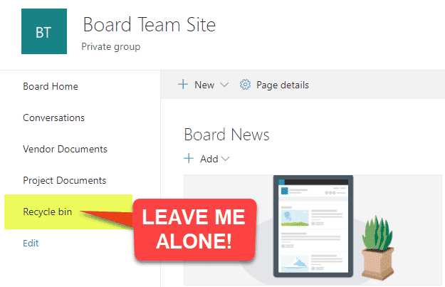
Recycle Bin
I can’t believe how many times I hear some users wanting to remove the Recycle Bin link from the left-hand side navigation of a Team Site. Remind me again, how your users will restore files once deleted? If it is a read-only site, perhaps you should have created a Communication Site where the Recycle Bin is hidden by default (but accessible via Gear Icon > Site Contents).
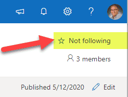
Follow a Site button
Another surprising element the users want to remove. The benefit of following sites is not always evident to end-users, but there are lots of significant reasons why you would want to leave this in place. Check out this post for more info.
SharePoint Start Page
This is the page you access when you click on Office 365 App Launcher > SharePoint.
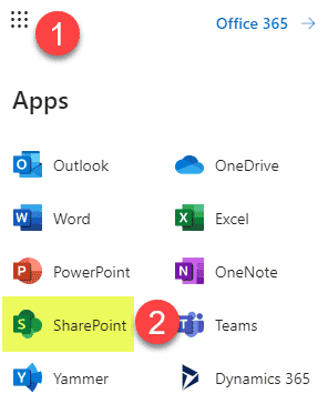
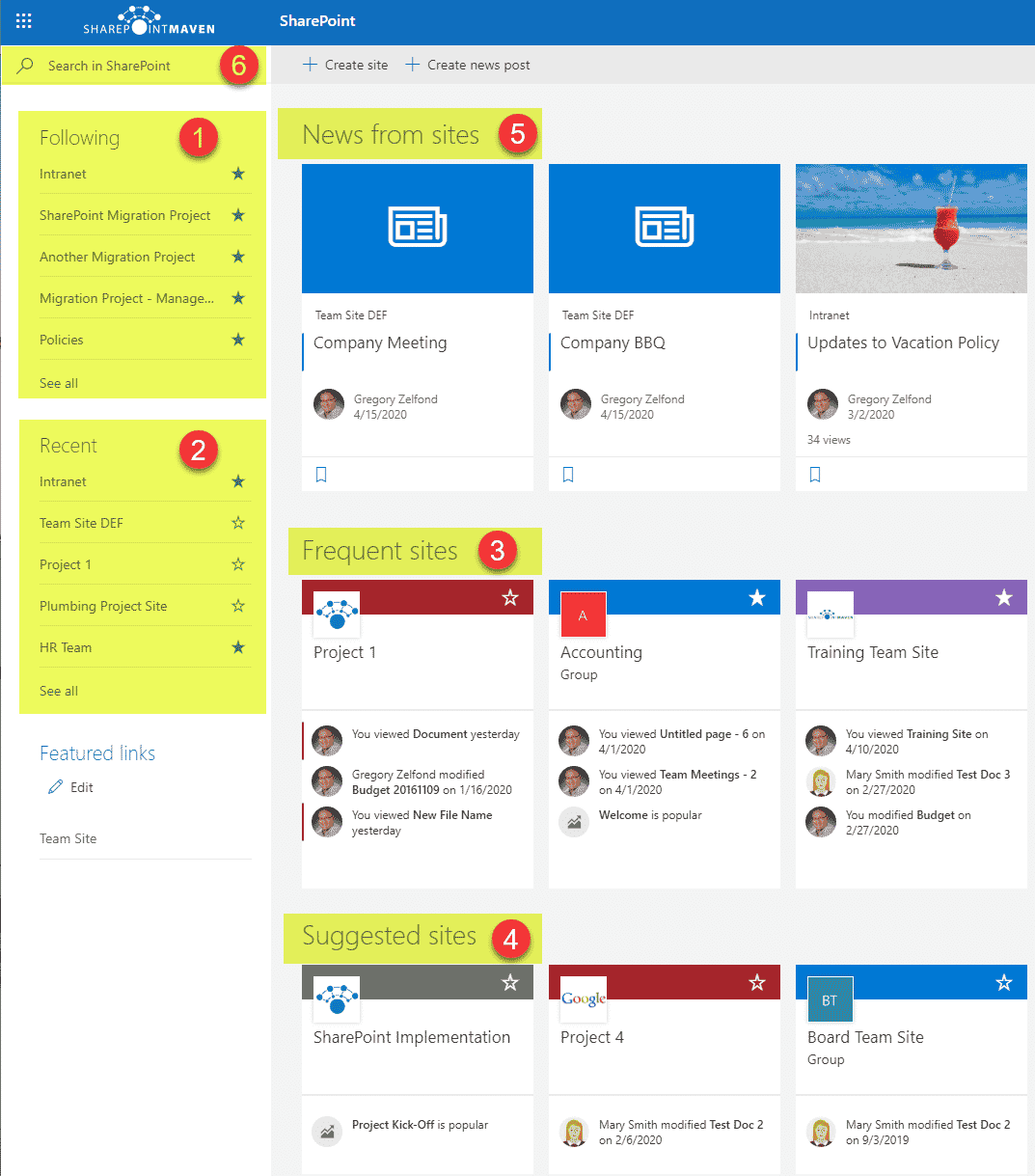
It happens to be the most misunderstood place in SharePoint. There is actually a way to hide it using the SharePoint Admin Center, but yet again, don’t bother. The problem here is not the link, but lack of training. The majority of users do not understand the objective of this page. But trust me, once they know what it is and what it does, users will keep checking it more frequently than Kim Kardashian’s Instagram account.
Mobile App Link
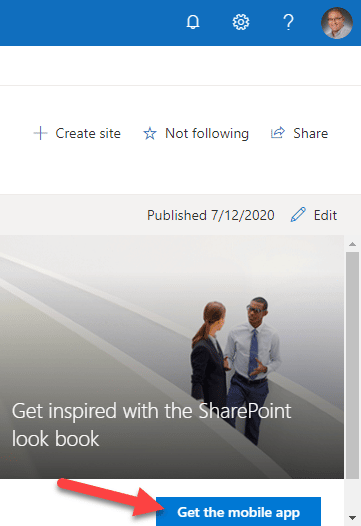
In the lower right corner of the SharePoint sites, users also get a pop-up reminding them to download a SharePoint mobile app. Why not allow users to take advantage of it and being able to access all the content and info from their phones? Yes, I know, even after you download the mobile app, the pop-up is still there, and yes, it might be a bit annoying, but try no ignore it don’t complain.
Other reasons why you should not remove default features in SharePoint
Out of the box = out of trouble
As stated above, the majority of these features require custom code/CSS to be removed. That means that when you implement this in your company and then leave the organization, users won’t be able to easily reverse engineer what you did. Another reason to stay out of the box.
We accept other apps as-is
You use Facebook and LinkedIn the way they are, with little ability to customize the buttons. So what’s with the sudden urge to keep things clean in SharePoint?


