Spacer and Divider Web Parts in SharePoint
There are two SharePoint Web Parts that probably don’t get the respect or attention they deserve. Unlike most web parts that actually allow you to store and present some content (i.e., News Web Part, Events Web Part, etc.), these two web parts are secondary in nature and are often “invisible” on the page as they help the page look nicer. I am talking about Divider and Spacer Web Parts. Let me show what they do and explain a few use cases for each.
Spacer Web Part
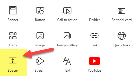
The Spacer Web Part allows you to add an empty space to a SharePoint page. This is great if you need to align elements or visually separate them for easy reading. To add a Spacer Web Part:
- Edit the page and choose the Spacer Web Part
- This will add the Spacer Web Part to the page. You can then choose the sizing handle to increase or decrease the size of the Space Web Part.

- The minimum height of the Spacer Web Part is 16 pixels, and the maximum is 320 pixels.
- You can also specify whether or not the Spacer will be visible on the Mobile device (via the Web Part Properties)

- This is what resizing the Spacer Web Part looks like

Use Cases for the Spacer Web Part
- Align Web Parts on a SharePoint Page
- Visually separate web parts on a page
Divider Web Part
Divider Web Part inserts a line that helps visually separate content on a page.
- Edit the Page and choose the Divider Web Part

- This will add the Divider Web Part to the Page. You can then adjust two additional settings: the Length of the Divider (20% to 100% of the Section Width) and Weight (1 to 6).

Use Cases
- Visually separate web parts on a page

An image of the SharePoint Intranet Homepage that contains both the Divider and Spacer Web Parts

Share Article