SharePoint Navigation Best Practices
Have you ever visited a SharePoint Site and felt like you are lost in the woods and don’t know where to go and where to click? Exactly!!! Today, I want to talk about one of my favorite topics – SharePoint Navigation. How important is SharePoint Navigation? As a matter of fact, it is so important, it is usually one of the first things that I modify or create when I work (or try to fix) clients’ SharePoint intranets. And there is a reason for it. First of all, it obviously serves an important function by letting me quickly reach the site or content that exists out there in a site collection. Second, navigation is an important aspect of User Adoption – poor and confusing navigation will quickly drive your users into “I hate SharePoint” crowd which is obviously not a desired outcome. That’s why, I decided to write this blog post and explain to my loyal blog readers the best practices of SharePoint Navigation.
What are available SharePoint Navigation types?
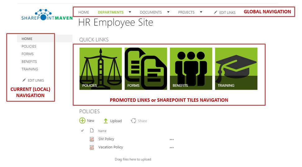
Global SharePoint Navigation
- Meant for “global” site navigation. Typically stays the same from site to site (i.e. links to Home, Department Sites, etc.)
- Usually appears horizontally at the top of the site/page
Local SharePoint Navigation
- Meant for “local” or “current” navigation within a site (i.e. links to web parts present on a site or some sub-sites)
- Appears on the left hand—side of a site/page
- Called “Quick Launch” in SharePoint

SharePoint Navigation via a list
Global and Local SharePoint navigation are great, but if you have lots of sites or content to link to – this can make both menus overcrowded and defeat the whole purpose of the friendly SharePoint navigation.
A good example is project sites. Say you have lots of project sites you want to build links to. Theoretically, you can place those on either on global or local navigation menus. But if you have, say 200 project sites to link to? This would be a challenge to navigate and maintain via the menus. A great alternative for this would be to create a separate site (in case of project sub-sites this could be a PMO Dashboard site) and place a dashboard of projects with links to each sub-site. So the only site you would link to top global navigation is that PMO Dashboard site and viola – you have a nice and user friendly navigation.

SharePoint Navigation via Promoted Links (SharePoint Tiles)
Another cool technique from User Adoption standpoint is to utilize a web part called Promoted links to assist users with SharePoint Navigation. You can see how it looks to the end user from first image above. I have actually written a separate blog post with step-by-step instructions on how to set it up. You access that post here.
Best Practices on SharePoint Navigation
- Always utilize consistent navigation approach for all sites you have (for example, top bar as global navigation and quick launch for local site navigation)
- Organize sites/content logically (i.e. group all department sites together, all project sites together, etc.)
- Do not add too many choices – less is more! Just add links to stuff people have to access. Overcrowded navigation modules will be a big turn-off for your users and drive your User Adoption down.
- If you are into advanced stuff, my recommendation would be to utilize managed navigation capability via Term Store. This would give you ultimate control over site navigation and will allow you to link content between sites and different site collections.


