The purpose of the Quick Look Column in Project for the Web
If you started using Project for the Web to manage projects within your organization, I am sure you encountered the mysterious Quick Look column that appears on every project schedule by default. In today’s post, I would like to explain the purpose of this column and what it does.
What is Project for the Web
Project for the Web is a web-based application that allows teams to manage tasks. Unlike its cousin Planner, Project for the Web allows teams to create more sophisticated task schedules, set dependencies on tasks, and manage effort and resources. To read more about Project for the Web and some of its capabilities, read this post.

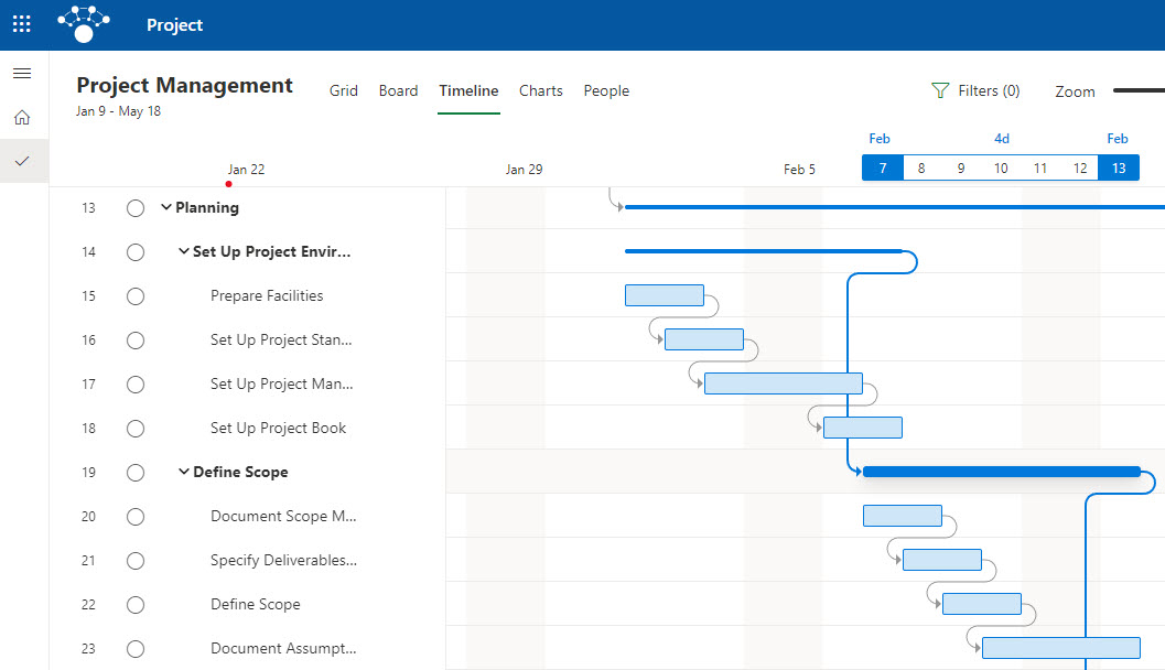
Sample Project for the Web Schedule in Project for the Web
Quick Look Column in Project for the Web
When you create a new schedule within Project for the Web, you get to see the Quick Look field available within the task plan by default. It is a Read-only field that a user can’t fill out. So what is it? Let me explain.

The Quick Look field shows whether or not a given task has additional information not displayed on a task schedule. Here is the additional information you can fill out on a task and shown as an indicator in the Quick Look column:
- Task Notes
- File Attachments
- Checklist
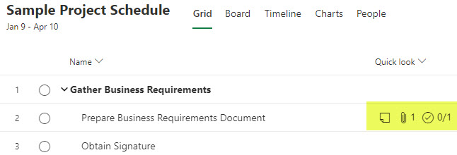
By default, when you create new tasks, these fields will obviously be blank. However, if you click on the “i” Project Details panel and populate a task with some task notes, attach a file or utilize a checklist option, it will show you the appropriate indicators within the Quick Look column. Otherwise, the users reading or completing the task might miss this important additional information and might not even know it even exists.
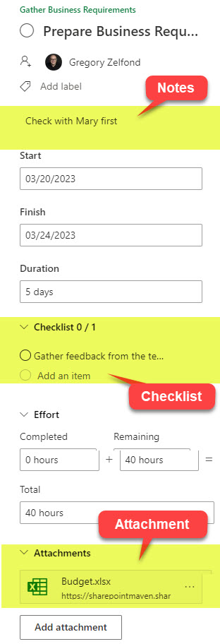
In the below example, I added some notes, attached a file, and added a few items to the checklist within a task.

And this is how the task grid looks to the users once the information is populated.


