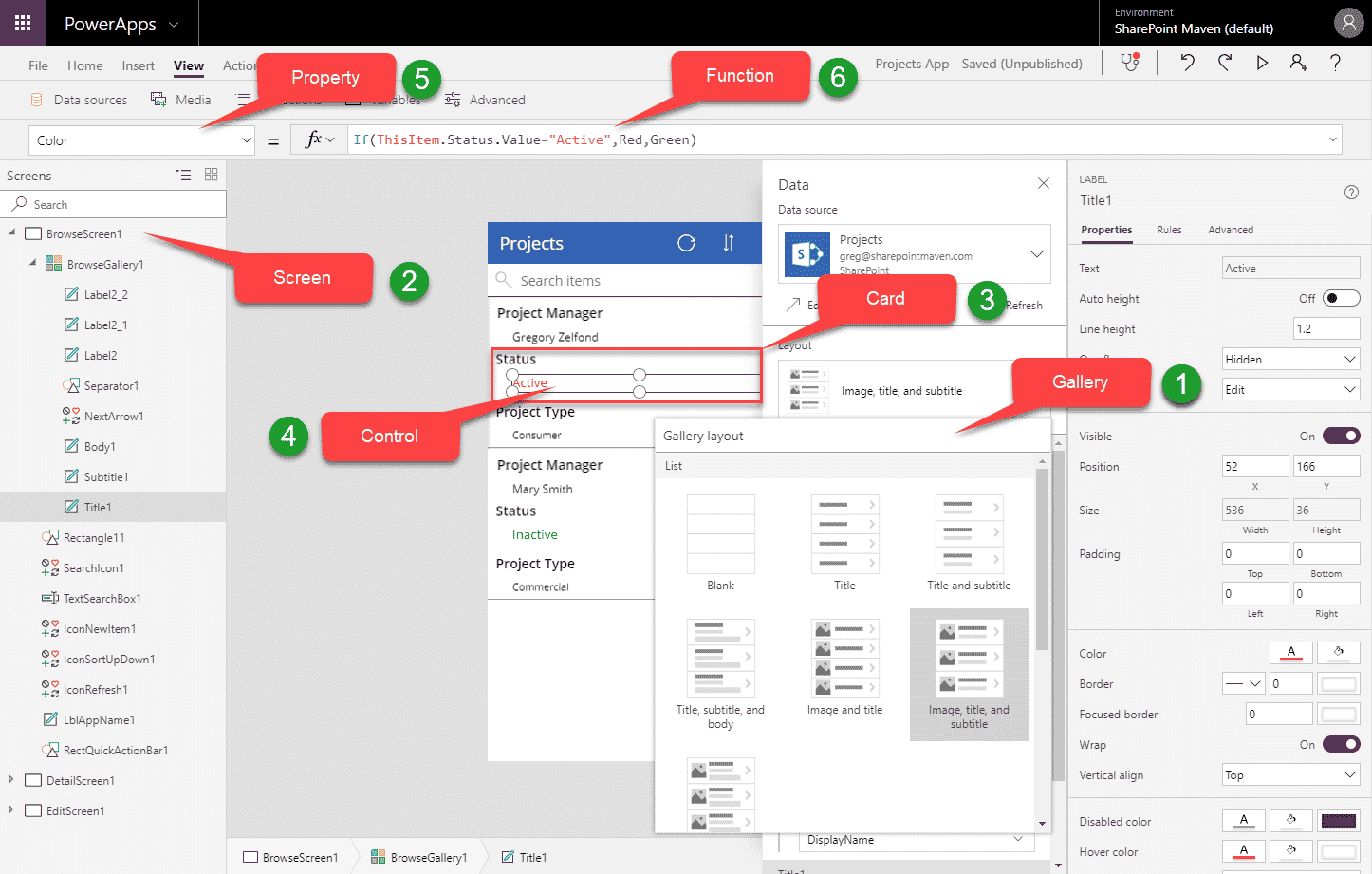
6 major components of PowerApps
If you want to embrace PowerApps, you first need to understand its anatomy and basic elements. With this post, I would like to highlight, what are, in my opinion, the major components of PowerApps one needs to understand first before creating the first app.
For those who are completely new to PowerApps, I suggest you check out this post first. It explains what PowerApps is all about.
1. Gallery
A gallery is a way of visualizing data in the app. It is a template of screens that allows you to see and navigate the data. For example, you might have a gallery that contains a screen to see all records, then a screen to view a given record and a screen to edit a record.
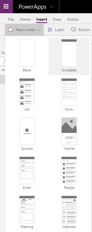
All of the screens combined make up a gallery. You have different galleries to choose from when you create a new app. When you create an app from SharePoint list, you get a default gallery already pre-built for you.
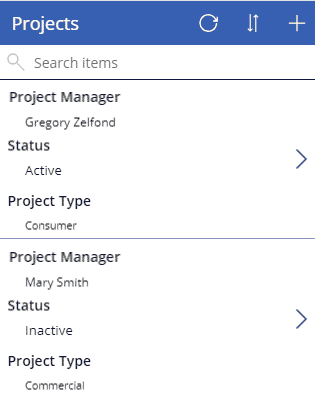
Example of a Screen based on a certain Gallery template
2. Screen
As eluded to in the previous section, a screen is a way to visualize a particular data set or record on a screen (mobile, iPad, Desktop). You typically have one to view all records, one to view a particular record, one to edit. Once again, when you create an app from the template, you have screens already pre-built for you (they are part of a gallery you choose above). But you can add additional screens if necessary.
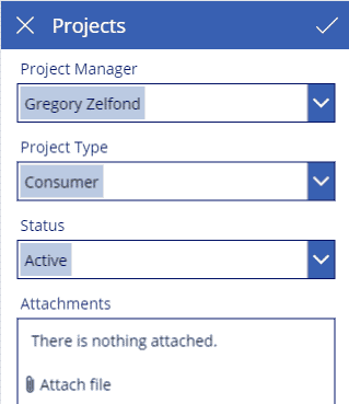
3. Card
A screen consists of cards. A card is an area on the screen that shows a given record from your SharePoint list or any other database you used to build an app. For example, if you had a SharePoint list storing project names and built a PowerApp from this list, a single card might contain a Project Name field or Project Manager field or Project Type field or a Status field.
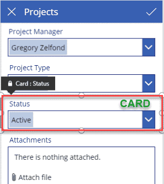
A card would contain all various attributes (called Controls in PowerApp – described below) related to the display of the record. For example, for Status field depicted in the image above, a card contains a Drop-Down control to enter Status as well as a label called “Status”.
4. Control
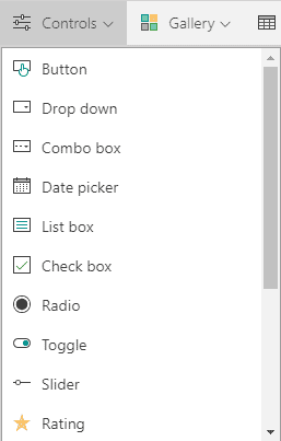
Controls is what allows you to visualize and interact with your records. Using the above Status field example, the Drop-Down to choose Project Status is a control. Depending on the type of your field, you can have different types of controls. For example, instead of a drop-down, I could have a radio button or toggle switch to make selection a bit more elegant on the phone app.
5. Property
Each control has properties. For example, a text entry box has a property for font size, text color, text box fill color and so on. Properties can be accessed and changed from the Properties drop-down on the left-hand-side of the screen as well as on the panel on the right-hand-side once the property is selected.
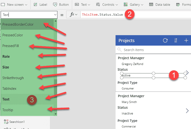
All the arrows point to properties of a certain control
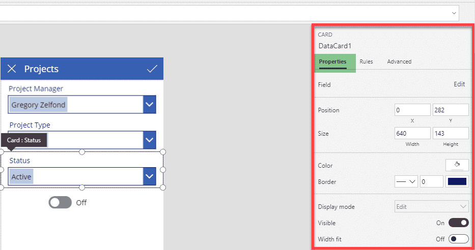
Another way to edit properties for the card
6. Function
Functions is how you interact with and change the properties. If you are familiar with Excel, you are in luck as the syntax for PowerApps functions is kind of similar to Excel. Below is an example where I use the Formula (If Statement) to change Property (Color) of a Control (Text) depending on the value of the field.
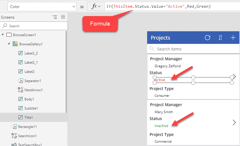
And now, putting it all together:
